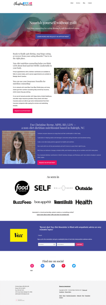
The Problem
Christine had built something worth being proud of — an inclusive, non-diet nutrition counseling practice serving adults and children in the Raleigh, NC area. She was growing, expanding into a group practice, and ready to become the go-to eating disorder nutrition resource in her market.
But her website was stuck in an earlier chapter of her business.
It was built around her as an individual practitioner, not a growing team. The messaging didn’t clearly communicate her non-diet philosophy — a critical differentiator in a space saturated with weight-loss-focused nutrition content. And while the site had some color and basic organization, it lacked the personality and authority a practice of this caliber needed.
There was also the matter of a complete rebrand on the horizon — new name, new logo, new domain. For a site that was already getting around 3,000 monthly visits from organic search, that’s a high-stakes move. Done wrong, a domain migration can wipe out years of SEO equity overnight.
In Christine’s words:
“I was so, so stressed about trusting someone with the huge task of re-branding my business and creating a new website.”
What We Set Out to Do
This project was more complex than a typical redesign — it was a full business rebrand paired with a strategic website overhaul. The goals were:
- Protect and grow SEO equity through a careful domain migration and expanded, optimized contentatform, reorganizing the site, and enhancing SEO with expanded copy and targeted messaging.
- Build a new brand identity that reflected the group practice Christine was growing into, not the solo practitioner she was moving away from
- Reposition the messaging around the team (“we”) rather than Christine alone
- Emphasize eating disorder nutrition support as the practice’s primary specialty
- Clearly communicate the non-diet approach to filter in aligned clients and filter out those seeking weight-loss-focused care
(And, it worked! After the rebrand and redesign, Ruby Oak Nutrition grew to 15,000 monthly visits — a 5x increase in organic reach, on a brand new domain.)

The Approach
Christine was evolving from a solo practitioner into a team, and the old branding didn’t reflect that. We developed a new logo and full brand identity for Ruby Oak Nutrition — one that felt warm, inclusive, and professional without centering any single person.
The visual direction needed to communicate trust, approachability, and clinical credibility all at once — no small task in the eating disorder nutrition space, where clients are often in vulnerable moments when they first reach out.
Messaging That Does the Filtering
One of the most important strategic decisions was making the non-diet philosophy unmissable. In a niche where so many people arrive via Google searching for weight loss support, clarity upfront saves everyone time and builds trust with the right clients immediately.
We restructured the homepage to lead with eating disorder nutrition support, and made the “we” of the practice visible throughout — team photos, plural language, and a Mission section that grounded the brand in shared values rather than one person’s story.
Expanded Copy for Authority and SEO
The original site had thin copy that wasn’t giving Google enough to work with. We expanded content across every core page — each service got its own dedicated page with optimized copy, clear process explanations, and messaging written around the terms Christine’s ideal clients are actually searching.
We also added a Resources page housing recommended books, podcasts, and niche organizations — a trust-building tool for visitors and an additional SEO asset for the practice.
Handling the Domain Migration
Moving from Christine’s personal domain to rubyoaknutrition.com was a necessary step for the rebrand — but it carried real SEO risk. We made sure proper redirects were in place so that the traffic and authority built under the old domain transferred cleanly to the new one, protecting the organic visibility she’d worked to build.

“I was so, so stressed about trusting someone with the huge task of re-branding my business and creating a new website. Jess’s calm demeanor and well laid-out process made me feel better from the jump, and kept me feeling that way all the way to the end of our project.
I had some ideas about what I liked and what I didn’t, but couldn’t articulate exactly what I wanted. Between Jess’s in-depth questionnaires and her asks for regular feedback as the branding and design process went on, she was able to build me a brand and website that’s SUCH a good representation of my brand and my business. The website she built looks gorgeous, and feels like a roadmap for my growing group practice!” – Christine
The Results: 5x Traffic Growth
At its peak, Christine’s old site under her personal domain received around 3,000 monthly visits. After the rebrand and redesign, Ruby Oak Nutrition grew to 15,000 monthly visits — a 5x increase in organic reach, on a brand new domain.
That’s not just more traffic. That’s more of the right people finding an eating disorder nutrition practice that’s equipped to help them.


A rebrand is one of the most stressful things a business owner can go through, especially when there’s existing SEO equity on the line and a growing team depending on the outcome.
Christine’s results show what’s possible when the strategy, the design, and the technical execution all work together: a new brand that feels right, a website that converts, and organic traffic that more than makes up for the risk of starting fresh.
Eating disorder nutrition, non-diet practices, and group practices are some of my favorite projects to work on. The stakes are high and the work matters.
Final Website Design Reveal


Ready to build a website that grows with your practice? Contact me today to learn how I can help.
