The Problem
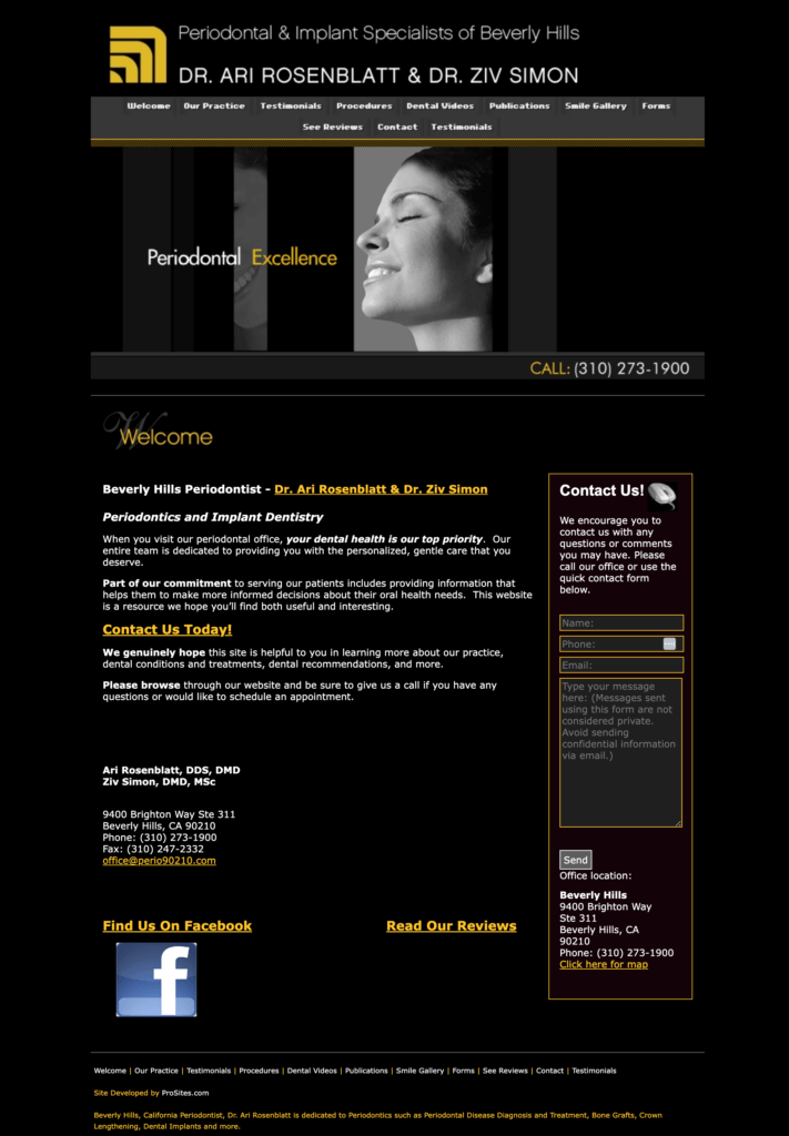
Periodontal & Implant Specialists of Beverly Hills has been one of California’s most respected periodontal practices since 1980. With a highly credentialed team and a clientele that expects nothing but the best, Ziv and Ari had built something truly excellent — but their website told a different story.
The site hadn’t been updated since at least 2011. Outdated fonts, no modern design elements, and a user experience that made it genuinely difficult to find basic information like how to book an appointment. For a practice serving Beverly Hills’ discerning clientele, the disconnect was significant.
The gap between the quality of their care and the quality of their online presence was costing them credibility, new patient inquiries, and search visibility.
What We Set Out to Do
When Ziv and Ari came to me, the goals were clear:
- Modernize the design to reflect the level of care and expertise they actually deliver
- Improve the user experience so prospective patients could easily find what they needed and take action
- Build a strong SEO foundation to help the practice show up when Beverly Hills residents searched for periodontal care
- Keep what was working — the existing logo and color palette — while using them in a more intentional, elevated way
The practice already had some SEO equity built up from years of existing online, but the site wasn’t optimized to take advantage of it. There was significant room to grow.
(Spoiler alert, it worked so much that three years later, they’ve now had to add two more dentists to their practice.)

The Approach
We moved the practice onto WordPress hosted on Flywheel, giving them far more design flexibility and access to powerful SEO tools than their previous setup allowed. We built the site using the Divi theme, which made it easy to create a polished, custom look without sacrificing performance.
Beverly Hills patients have high expectations. The new design needed to feel clean, trustworthy, and elevated — not clinical and cold, but not overly casual either. We kept the existing brand colors but used them more intentionally throughout the site to create a cohesive, professional feel.
Ready to close the gap between your expertise and your online presence? Let’s talk.
A few design decisions worth highlighting:
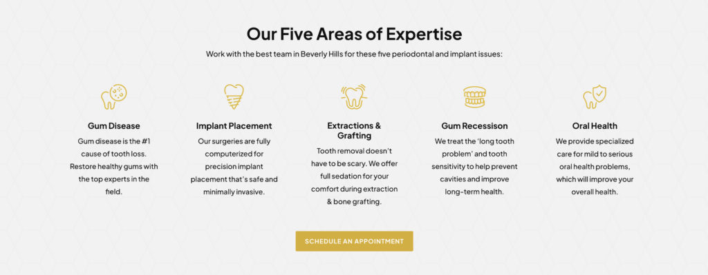
- Illustrated icons on the homepage gave visitors a quick, visually engaging overview of services without overwhelming them with text
- Quicklink navigation bars on key pages let users jump directly to the information they were looking for — especially useful for patients comparing treatment options
- Prominent calls-to-action on every page made it impossible to miss how to get in touch, with the phone number, a patient testimonial, and a scheduling prompt consistently visible

Copywriting and SEO Strategy
One of the biggest opportunities was content. The original site had thin copy that wasn’t working hard for them in search. We gave Google what it needed to understand the site as authoritative and relevant:
- Each service got its own dedicated page, fully optimized with copy, images, and metadata specific to that treatment
- Copy was written with both the patient and the search engine in mind — clear, readable, and structured around the terms Beverly Hills patients actually search for
The Results
Ziv and Ari did have a little bit of SEO since their website had existed for so long, even though their site wasn’t optimized. But, the goal was really to help them increase how much they were showing up on page one since they are such a localized practice. As you can see below, the number of rankings they got quickly increased! (We did this website in early September 2023.)
Within just two months of launching the new website, we nearly doubled how much they are showing up in the top three search results! (And an update in 2026: three years later, they’ve now had to add two more dentists to their practice.)
For a highly localized practice like this one, showing up on page one for the right searches isn’t a vanity metric — it’s how new patients find them. The new site gave them the foundation to compete and win in one of the most competitive healthcare markets in the country.
Ready to close the gap between your expertise and your online presence? Let’s talk.


Final Website Design Reveal


Ready to close the gap between your expertise and your online presence? Let’s talk.
