As a business owner, your dietitian website should be one of the top sources of new patients and clients for your private practice. When I built my first website 10+ years ago, I overthought everything. Fonts. Buttons. What shade of blue felt “professional but not boring.” And even after I hit publish, I wasn’t getting the right kinds of inquiries. (Sound familiar?)
Research shows approximately 83% of users conduct online research for health-related questions! If your site isn’t converting well, it’s not always a traffic problem—it might be a strategy problem.
(Psssst…you might also like my post about fighting health misinformation online.)
What makes a great dietitian website?
A great dietitian website does four things well: it looks modern but has personality, functions flawlessly for potential patients, communicates your value clearly, and gets found on Google. After 14+ years designing websites for dietitians and nutritionists—and 400+ client sites under my belt—I can tell you that most sites fail on at least two of these. The ones that win do all four.
When putting together this list of great dietitian website examples, there were a few things I looked at:
How does it look? As a web designer, this is usually the first thing that catches my eye. How do they use their color palette, how is the layout, do they have good photos, and so on. I’ll be covering some of these principles with the examples below.
How does it work? I’m a big believer that form is usually more important than function. Design is not the ONLY goal. Does the site load fast? Is the text legible? Do things actually WORK on the site? Functionality is key to convert website visitors into clients.
Does it make sense? A big mistake I see in a lot of dietitian websites is people being too vague in their copy and what they do. To capture the visitor’s attention, we need the site to be engaging and clear. This usually comes down to clear messaging and copy, but also layout.
Is it SEO-friendly? When I first started learning SEO, I thought it was all about stuffing keywords and writing blog posts no one would actually read. But once I saw one of my clients double their traffic in a few months just by fixing headings and adding the right keywords? I was hooked.
A beautiful site matters—but if no one finds it, it’s not working.
Loving someone else’s website is 10% of the work. Knowing why it converts (and how to make yours do the same) is the other 90%. I design SEO-optimized websites that work hard for you behind the scenes. Learn more here!
15 examples of great dietitian websites
…from a web designer who drinks too much Diet Dr Pepper and reads way too many twisty thrillers.
When you work with me, you’re not just getting someone who cares about color palettes and Google rankings (though yes, I care a lot about both). You’re getting a partner who gets what it’s like to build a business that actually reflects you.
I’ve worked with dozens of dietitians—private practice owners, media experts, course creators—and every one of them had different goals. Some wanted to book more discovery calls. Others needed to look more legit for speaking gigs or brand deals. And almost all of them said the same thing:
“I’m embarrassed to send people to my website.”
If that’s you, this post is for you. (Oh, and if you also love a good thriller? We’d probably be fast friends.)
Melissa Landry Nutrition
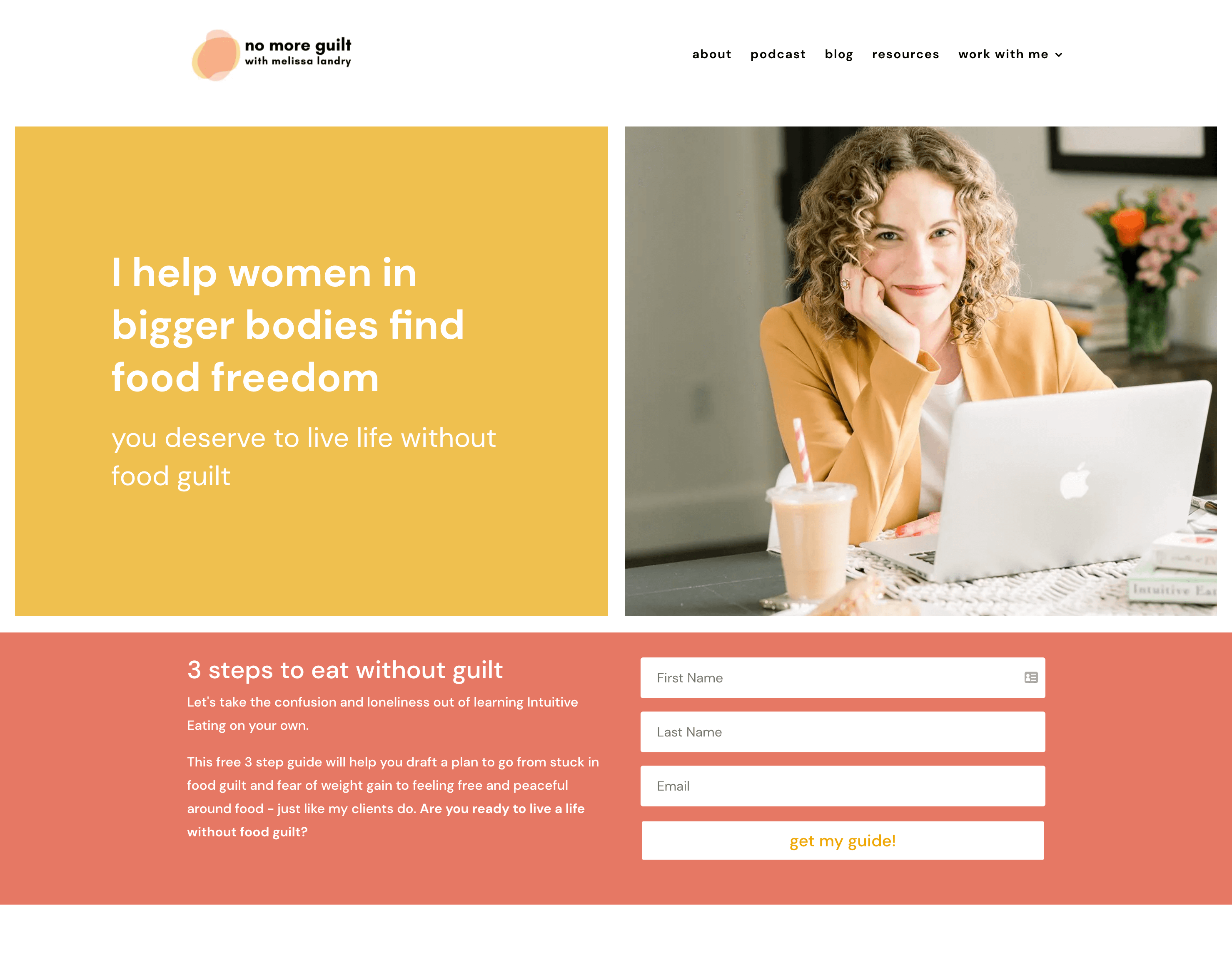
Melissa Landry is a registered dietitian nutritionist and food freedom expert who helps women in bigger bodies find food freedom, and enjoy food without guilt. Melissa’s Wordpress website is bright and cheery, while only utilizing two colors! This is a great example of having a colorful and bright site, without needing 5-6 different colors across the website.
What I love most about this site is what it proves: you don’t need a rainbow to make a site feel alive. Melissa’s color palette does the heavy lifting on personality, while her layout keeps the focus on her message and her call to action. Her photos are warm and relatable, which matters enormously when your ideal client is someone who’s been burned by the wellness industry before. The design signals safety before a single word is read.
The copy also does something a lot of dietitian sites miss — it speaks directly to the emotional experience of the client, not just the clinical outcome. That combination of warm visuals and emotionally resonant messaging is exactly why sites like this convert.
Designer’s Insider Tip: Two-color websites sometimes outperform multi-color sites in many niches because they create stronger visual contrast and more predictable hierarchy. When you limit your palette, every color choice becomes intentional — your eye always knows where to go next. The mistake most DIYers make is adding a third or fourth color “just to break things up,” which sometimes creates visual noise and dilutes brand recognition. Constraint is a design superpower.
Website: Melissa Landry Nutrition
Truly Real Nutrition

Ayana Habtemariam is a nutrition therapist, certified intuitive eating counselor, and macro social worker. What’s unique about her Squarespace website is that it’s a (mostly) one-page website! (She has a blog, so that’s what technically makes it more than one page.) Ayana’s website is a great example of how one-page websites don’t have to be boring. She utilizes some light illustration backgrounds, great photos, and even a video of her!
One-page sites get a bad rap for feeling too simple or cheap, but Ayana’s proves that assumption wrong at every scroll. She layers illustration backgrounds, incorporates a video of herself, and uses strong photography to break up the sections in a way that feels dynamic rather than flat. Each scroll feels intentional, not like you’re just moving down a long document. The result is a site that feels intimate and personal — which makes complete sense for someone whose work is rooted in the intersection of nutrition, body image, and social justice.
The video is a smart move too. For a practice built on trust and therapeutic relationship, letting visitors hear and see you before they ever reach out dramatically lowers the barrier to booking.
Designer’s Insider Tip: One-page websites have a significant speed advantage over multi-page sites because the browser only has to load a single document and page load speed is a confirmed Google ranking factor. They also tend to have lower bounce rates because scroll depth keeps users engaged longer than click-through navigation. The catch is that your sections have to function almost like individual pages in terms of clarity and purpose. If yours can do that, a one-page site might actually be the smarter SEO and UX choice for a solo practitioner.
Website: Truly Real Nutrition
Plant Centered Nutrition

Ashley Kitchens is a registered dietitian nutritionist and virtual nutrition coach who helps people transform their relationship with food. Ashley’s ShowIt website utilizes strong outlines, texture, and illustrations. What you’ll also notice is a nice big video on the Home page! This is a great way to add some pizzazz to your website, even if it’s only on one page. I’d love to also point out her amazing photos across the site – both of her and the food.
The homepage video is the first thing you notice, and it sets the tone immediately. Video above the fold is still underused in this space, and when it’s done right — meaning it’s high quality, on-brand, and loads without killing your page speed — it creates an immediacy that static images simply can’t match. Visitors feel like they know Ashley before they’ve read a word.
Her food photography is also worth calling out specifically. Too many dietitian websites use generic stock photos of salads and measuring tapes (please, never a measuring tape). Ashley’s photos are warm, real, and aspirational in the right way — they show what her version of healthy eating actually looks like, which reinforces trust and specificity.
Designer’s Insider Tip: ShowIt is one of the few website platforms built specifically for designers first, which means it gives you pixel-perfect control that Squarespace and even WordPress page builders can’t fully match. The tradeoff is that it runs on WordPress under the hood for the blog, which means your blog content is actually SEO-indexed through WordPress while your visual design lives in ShowIt. For dietitians who want a highly custom, editorial-feeling site and strong blogging SEO, this split architecture can be a great choice.
Website: Plant Centered Nutrition
Nutrition Moderation

Alexandra King is a hormone nutritionist who helps women deal with the side effects of their birth control and balance their hormones. Alexandra’s Wix website really only has 1-2 colors (both being pink), so this is a great example if you’re not someone who loves having a ton of colors on your website. Having minimal colors can actually make your site feel overall more cohesive! And while not all women love pink, this color does fit her brand well, since she exclusively works with women.
This is a site that would make a lot of designers nervous in the concept phase. “All pink? Won’t that feel limiting?” But Alexandra’s brand works precisely because of that commitment. Her audience is exclusively women dealing with a very specific hormonal issue, and the soft, feminine palette signals immediately that this space was built for them. There’s no ambiguity about who belongs here. That kind of visual specificity in a niche practice is incredibly valuable — it pre-qualifies visitors before they read a single line of copy.
The layout is clean and uncluttered, which keeps the focus on her messaging and her offer. Nothing fights for attention. For a solo practitioner who wears all the hats, having a site that doesn’t require constant updates or complex navigation to feel polished is also a practical win.
Designer’s Insider Tip: Monochromatic color schemes (using one hue in multiple tints and shades) are actually one of the most sophisticated approaches in design because they force you to create contrast through value (light vs. dark) rather than hue. Most people reach for multiple colors when they want visual interest, but varying the lightness and saturation of a single color creates depth that reads as intentional and refined rather than busy. It’s also far more forgiving if you’re choosing colors without a designer’s eye — you can’t accidentally clash with yourself.
Website: Nutrition Moderation
The Hormone Dietitian

Melissa Groves Azzaro is a registered dietitian who uses a functional medicine approach to help women figure out the root causes of their symptoms. Melissa’s brand and Wordpress website has a more luxurious feel, which is heavily influenced by the fonts and colors of her website. The serif font, the metallic texture, and the black and white color palette all give her brand this more elevated feel. Keep that in mind when you consider what you want your brand personality to be!
That feeling doesn’t come from expensive custom photography or a massive design budget. It comes from a very deliberate set of choices: a serif font that reads as authoritative and refined, a black-and-white base palette with metallic texture accents, and a layout that gives content room to breathe. These three elements, working together, signal expertise and premium positioning without a single word of copy needing to say “I’m the best.” The design says it.
This is especially strategic in the functional medicine space, where clients are often investing significantly more than they would in a standard dietitian visit. The site needs to look like it matches that investment level. Melissa’s does. If your services are premium-priced, your website absolutely needs to reflect that — mismatched positioning is one of the most common (and costly) conversion killers I see.
Designer’s Insider Tip: Serif fonts carry decades of psychological association with authority, legacy, and trust — think law firms, luxury fashion houses, and academic institutions. When a health practitioner uses a serif as their primary heading font, it subconsciously signals credibility in a way that trendy sans-serifs don’t. The metallic texture layer does something similar: it adds tactile richness that flat digital design usually lacks, making the brand feel more substantial. Neither of these elements costs extra to implement — they’re just design decisions that most people don’t know to make intentionally.
Website: The Hormone Dietitian
Street Smart Nutrition

Cara Harbstreet is an intuitive eating registered dietitian and nationally-recognized food and nutrition expert. Cara doesn’t work with patients 1:1 anymore, but focuses her time on partnering with brands and corporations to create nutrition content. But, her website doesn’t feel like “just a blog” like many blogger websites do. Her Wordpress website is simple, yet elegant. I wanted to highlight her site, not just for the design and layout, but because you may also be someone who doesn’t want to work 1:1 with people!
What I appreciate most here is that it doesn’t try to be something it’s not. A lot of practitioners who shift away from direct client work end up with a site that feels like an awkward hybrid — half “book a session,” half “hire me for content.” Cara’s avoids that entirely. The design is simple and elegant, letting her credentials and body of work do the talking. It functions more like a professional portfolio than a practice website, which is exactly right for her business model.
If you’re a dietitian whose revenue comes primarily from speaking, writing, or brand work rather than patient sessions, this is the template to study. Clean, credible, and conversion-focused for the right audience — not a general one.
Designer’s Insider Tip: Portfolio-style websites for media-facing practitioners should prioritize “above the fold” credibility signals — logos of outlets you’ve been featured in, publication names, brand partner logos — over personal photos and warm welcome copy. This is because the person hiring you for a brand deal or media segment is evaluating your authority and reach, not your bedside manner. A simple “As Seen In” logo bar near the top of your homepage can do more conversion work than three paragraphs of bio copy.
Website: Street Smart Nutrition
Colleen Webb Nutrition

Colleen Webb is a registered dietitian who specializes in working with people with inflammatory bowel disease. But, she’s not just someone who works 1:1 with clients. Colleen also does a lot of writing and media interviews, and also has resources for other dietitians. Even with all of these things going on, her Wordpress website is simple and streamlined. Plus, her color scheme is very calming. This is another example of how the photos and colors you use influence the brand personality!
The way she pulls this off is through ruthless simplicity in the visual design. Her color scheme is calm and cohesive — soft, muted tones that feel clinical without feeling cold — and the layout is streamlined enough that each section gets its moment without competing with the others. The navigation does the heavy lifting of directing each type of visitor to the right place, rather than trying to serve all three audiences on the homepage simultaneously.
This is a genuinely hard balance to strike, and it’s something I work through with a lot of my clients who have layered business models. Colleen’s site is a good reference point for anyone who has outgrown the “one offer, one audience” model but isn’t ready for a full multi-site setup.
Designer’s Insider Tip: When you have multiple audiences, the instinct is to address all of them on the homepage. Resist it. Instead, use your homepage to speak to your primary revenue driver, and route secondary audiences via navigation or a simple “Are you a dietitian? Click here” callout. Trying to write homepage copy that resonates with both IBD patients and fellow RDs simultaneously almost always results in copy that resonates with neither. Segment through navigation, not through your hero section.
Website: Colleen Webb Nutrition
Methodd Nutrition

Gabi Kahn is a registered dietitian who helps moms find peace in their relationships with food and learn to love their bodies. Gabi’s Squarespace website is simple and modern, a fantastic example of someone doing one thing, and one thing WELL. Gabi only helps moms, and only has one way to work with her, so the site makes it clear what she wants you to do. Just because you have one offer doesn’t mean your dietitian website has to be boring!
A lot of practitioners feel pressure to diversify their website — add more pages, more offers, more options — because they worry a simple site will look unfinished or underwhelming. Gabi’s site is the counterargument. It’s modern, clean, and immediately clear. Because there’s no clutter competing for attention, the visitor’s eye goes exactly where it should: to who she helps and how to work with her. That clarity is a conversion asset.
There’s also something worth noting about the confidence this kind of site communicates. When you’re not hedging with five different offers and fifteen pages of content, it signals that you know exactly who you serve and what you do. That conviction is visible in the design — and clients feel it.
Designer’s Insider Tip: Single-offer websites almost always have higher conversion rates than multi-offer ones because they eliminate what UX designers call “decision paralysis.” The more choices a visitor has, the more cognitive load they carry — and the more likely they are to leave without doing anything. If you only have one way to work with you, don’t manufacture complexity. A tight, focused site with one call to action will outperform a sprawling site with six options nearly every time.
Website: Methodd Nutrition
Greenletes

Natalie Rizzo is an NYC-based registered dietitian who helps athletes fuel their fitness and maximize their performance. Natalie is another example of someone who doesn’t work with clients, but has resources available for athletes in the form of courses, ebooks, and her podcast. She also does a lot of media appearances and writing! What I want to note here is the dynamic designs across the Wordpress website (especially shown here in the screenshot) that really convey movement, which fits nicely since she helps athletes!
The dynamic layouts, bold typographic choices, and action-oriented photography all work together to make the site feel like it was built for people who are always in motion. This is intentional, strategic design — not just aesthetics. When your ideal client lands on your site and immediately thinks “this feels like me,” you’ve already won half the conversion battle. Natalie’s site creates that recognition instantly for athletes.
She’s also another example of a practitioner who doesn’t do 1:1 client work but has built a robust content and product ecosystem — courses, ebooks, a podcast, media partnerships. The site architecture supports all of it without feeling like a content dumping ground, which is harder to achieve than it looks.
Designer’s Insider Tip: Diagonal lines, angled section dividers, and asymmetric layouts create implied movement in a static design — they make the eye travel across the page rather than reading straight down. This is a technique borrowed from sports branding, where energy and dynamism need to come through in a logo or jersey design. If your niche involves physical activity, performance, or any kind of transformation, incorporating even subtle diagonal design elements can make your brand feel more aligned with your audience’s self-image than a standard horizontal grid ever could.
Website: Greenletes
Culina Health

Culina Health is a practice co-run by registered dietitians Tamar Samuels and Vanessa Rissetto. This Wordpress website is so clean and beautiful, but what I want to really point out is the brush strokes used throughout the site (as you can see to the left of the image in the screenshot). It’s a simple texture but used around the site here and there. This gives the site a more cohesive feel, without overdoing it.
It sounds like a small thing. It isn’t. That single repeated texture element is what makes the whole site feel cohesive rather than assembled. Without it, the pages would read as a series of clean but disconnected sections. With it, there’s a visual thread running through everything that signals intentional, professional design at a level most visitors can’t articulate but absolutely feel.
For a group practice that needs to project both clinical credibility and approachable warmth, this balance is critical. The site manages to feel premium and human simultaneously — which is exactly the positioning a multi-practitioner insurance-accepting practice needs.
Designer’s Insider Tip: Repeating a single custom texture, shape, or graphic element across your site is one of the most cost-effective ways to elevate a design from “nice” to “branded.” It creates what designers call visual continuity — the sense that every page belongs to the same world. The element doesn’t need to be complex: a brush stroke, a leaf shape, a simple line pattern. What matters is that it’s used consistently and sparingly. Overuse kills the effect. Think of it as a seasoning, not an ingredient.
Website: Culina Health
The Tasty Balance

Ariel Johnston is a registered dietitian who helps women who struggle with disordered eating. Ariel’s Wordpress website is a perfect combination of illustrations and a calm color palette, while still using a good amount of color across the website! It’s professional and fun without being loud or overwhelming. Design is always a balancing act! (Just imagine how different the brand would feel if they used bold or neon colors!).
The combination of soft illustrations and a muted, warm color palette creates an environment that feels gentle without feeling sterile. There’s personality here — you can see Ariel’s warmth in the design choices — but it never tips into loud or overwhelming, which would be exactly the wrong signal for her specific audience. This is a perfect example of design serving the clinical and emotional context of the work, not just looking pretty.
The illustrations do double duty: they add visual interest across the pages, but they also sidestep some of the complications that come with photography in the eating disorder recovery space, where images of food or bodies can be sensitive. That’s a thoughtful, audience-aware design decision.
Designer’s Insider Tip: Custom or semi-custom illustration sets are one of the best investments a solo practitioner can make if their niche involves sensitive topics where stock photography can easily backfire. Stock photo libraries are full of images of thin, white women eating salads — a minefield for anyone working in intuitive eating, HAES, or disordered eating recovery. Illustrations let you control representation, avoid triggering imagery, and create a visual language that’s entirely your own. Sites like Creative Market and Etsy have affordable illustration packs that can be adapted to match your brand colors without a full custom commission.
Website: The Tasty Balance
Alix Turoff Nutrition

Alix Turoff is a registered dietitian, certified personal trainer, and virtual nutrition coach who offers both 1:1 coaching and group coaching. Alix’s ShowIt website is one that has been brought to my attention numerous times as an inspiration to my clients who want a bolder, more colorful website. This is definitely a dietitian website to check out if you want something more fun and bold!
This site has come up as inspiration more times in my client onboarding calls than almost any other in my portfolio of references, and it’s easy to see why. The color choices are confident and joyful, the layout has energy, and the overall feeling is one of a practitioner who knows exactly who she is and isn’t trying to soften that for anyone. In a space where so many dietitian websites default to soft sage green and beige minimalism, Alix’s site stands out immediately — and that distinctiveness is a business asset.
It’s also worth noting that bold, colorful sites like this attract a very specific type of client: one who is drawn to that energy, who wants a practitioner with that kind of personality. The design is doing pre-qualification work before anyone reads a word.
Designer’s Insider Tip: High-saturation color palettes require more careful management of contrast ratios than soft or neutral palettes do — which matters for both accessibility and readability. When you’re working with bold colors, your text placement becomes critical: dark text on a light background and light text on a dark background must meet WCAG accessibility standards (a contrast ratio of at least 4.5:1 for body text). Many bold, colorful DIY sites fail this test, which can actually hurt your Google rankings since accessibility is factored into Core Web Vitals scoring. If you’re going bold, run your palette through a contrast checker before you build.
Website: Alix Turoff Nutrition
Side by Side Nutrition

Jamie Magdic is a registered dietitian and the founder of Side by Side Nutrition––a HAES, weight-inclusive group of registered dietitians. I wanted to highlight this Squarespace website, not only because of the great design, but because it’s an example of a site that does not majorly feature the dietitian(s). As the business owner, you don’t have to be front and center in the photos on every page, especially if you’re more of a team, and it’s not just you!
Most solo practitioner sites — and even many group practices — lead heavily with photos of the owner. It makes sense for a personal brand. But Side by Side is a team, and the site reflects that. The photography and design don’t feature Jamie front and center at every turn, which makes the brand feel more expansive and the practice feel more accessible. It also sets up a more scalable business model — when the brand isn’t built entirely around one face, growth is easier.
The design itself is warm and welcoming in a way that aligns perfectly with the HAES philosophy the practice is built on — nothing clinical, nothing that signals diet culture, everything that signals inclusion and safety.
Designer’s Insider Tip: If you’re building or growing a group practice, resist the urge to brand everything around your personal image. Websites that over-feature the founder create an unintentional messaging problem: potential clients may assume they’ll only work with you, leading to disappointment and increased admin overhead when you route them to an associate. Instead, use team photography, feature associate bios prominently, and write copy that speaks to the practice’s values rather than your personal story. This pays dividends when you’re ready to scale, hire, or eventually step back.
Website: Side by Side Nutrition
The Healthy Shine

Starla Garcia is a registered dietitian, Olympic Trials marathoner, and body and cultural diversity advocate. Starla works with runners and athletes to help improve their relationship with food. The Wordpress website features two main colors (blue and orange), and some light illustration work. The photos that Starla uses really match her audience, as they feature her doing a lot of running (and cooking). Photos are SO important for a great dietitian website!
Across the site, you see Starla running, cooking, and living the life her clients aspire to — not generic wellness stock photos, not a detached clinical headshot, but real images that communicate “I am one of you.” For an audience of runners and athletes, this is powerful. The two-color palette of blue and orange has the same energetic contrast we saw with Greenletes, and the light illustration work adds personality without overcomplicating the design.
The cultural diversity advocacy piece of Starla’s brand is also visually present in a way that’s authentic rather than performative, which matters to her audience. The site doesn’t just say it welcomes diverse clients — the design choices demonstrate it.
Designer’s Insider Tip: Brand photography is the single highest-ROI investment most practitioners can make in their website — more than a platform upgrade, more than a new theme, more than a logo redesign. The reason is simple: humans make emotional decisions first and rational decisions second, and photos are processed emotionally before any copy is read. Photos that show your specific audience — their body types, their activities, their demographics — signal belonging before a single word lands. If your photos don’t look like your ideal client, your site is working against you regardless of how good the copy is.
Website: The Healthy Shine
Nutrition by Robyn

Robyn Johnson is a functional medicine dietitian and health strategist who helps women get to the root cause of their hormone and skin problems. Robyn’s site is so clean, modern, and elegant. With so many examples in this post with illustrations, I loved how simple this dietitian website compares to the others. Robyn’s Squarespace website is a great example of how you can have a simple site without it *just* being text and photos. Small design elements are sometimes all you need.
What Robyn’s site demonstrates is that “simple” is not the same as “boring,” and that you don’t need graphic elements and custom illustrations to create a site that feels polished and premium. Small, intentional design details — thoughtful white space, a refined type pairing, consistent alignment — carry the whole thing. The result is a site that feels modern and confident without a single unnecessary element.
For practitioners in the functional medicine space, this kind of elevated minimalism often resonates strongly with the clientele: people who are done with noise and are looking for someone who clearly knows what they’re doing. The design communicates that before you read a word of Robyn’s credentials.
Designer’s Insider Tip: White space — the empty space around and between design elements — is one of the most misunderstood tools in DIY web design. Most non-designers see empty space as something to fill. Professional designers see it as an active element that creates breathing room, directs focus, and signals confidence. Cramped layouts feel anxious and amateur; generous white space feels authoritative and intentional. If your site feels cluttered, the fix is often not adding anything — it’s removing padding constraints, reducing the number of elements per section, and trusting the space to do its job.
Website: Nutrition by Robyn
What You Can Learn from These Dietitian Website Examples
Looking through all of these examples, it’s clear that there’s no one-size-fits-all approach to a great dietitian website. Some are bold and colorful, others are minimalist and calm. Some focus on 1:1 services, others on content and media. The best website for your business is the one that clearly communicates who you are, who you help, and what action your audience should take.
Key Takeaways for Your Own Dietitian Website:
- Clarity beats cleverness – Make it obvious what you do and who you help
- Design supports conversion – Use colors, fonts, and layout to guide attention
- Mobile and speed matter – Your site should load fast and work great on phones
- Strong visuals elevate your brand – Invest in high-quality photos or illustrations
- One call to action per page – Don’t overwhelm visitors with too many choices
- Stay true to your brand personality – Whether you’re fun and bold or calm and clinical, consistency matters
Thinking about a dietitian website redesign?
I’ve worked with dietitians who:
- Wanted a sleek site to attract high-profile media gigs,
- Needed a softer tone to support eating disorder recovery,
- Or were pivoting from 1:1 coaching into course sales.
And every time, the best websites were the ones that reflected their real personality and their real goals.
There’s no one-size-fits-all here. That’s what makes these examples so helpful—they show what’s possible when you stop trying to follow the “shoulds” and start building a site that actually supports how you work.
I’d love to help you create a dietitian website that perfectly reflects you as a dietitian, and helps grow your private practice. You can check out my portfolio, or my client testimonials. I also have a post with resources on creating your own dietitian website!
